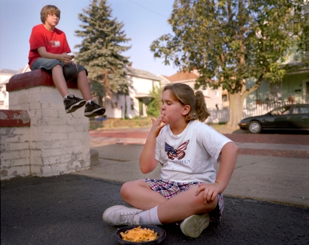
So I am in the midst of what feels like this monolithic website update and I am editing some new images for Consumed and I am incredibly visually fatigued with my work. I’d appreciate any input on which variation of the image you prefer from a pre-dinner snack of microwaved cheese fries during a pitstop in Cumberland, MD en route from other adventures. They are not still in a raw scan mode, but do you like image #1, #2 or neither? My mind has turned to jelly.

© Susana Raab 2008
© Susana Raab 2008
And if you hate them both, please say so, no worries about hurting my feelings – I am so far beyond feelings right now.

I prefer #2. For me, in #1, although I love that head-back thing she’s doing, the guy in the background is distracting and doesn’t really add anything to the image. Whereas in #2, the kid in the background is looking at her in a way that’s important. (Plus, I like the light on his head and shoulders.) The only problem I have with #2 is the position of the cheese fries: I wish they weren’t so close to the edge of the frame. (I know there’s nothing you can do about that, but I thought I’d mention it, because it might be a reason to cut the image. . . . I don’t think it’s as strong as so many others in Consumed, but it’s different and really amazing as a scene, so part of me says keep it.
LikeLike
I agree with Liz. I think #2 flows better,at the same time I am drawn to #1 because of the ‘head back’ gesture. Unfortunately I really think it is up to you to decide depending on what kind of emotion you want to convey, and here I think the first image conveys ‘consumed’ better.
go figure…….!:)
LikeLike
I think #1.
LikeLike
Ummm, but I haven’t slept in three days.
LikeLike
I like number 1. Like the others said, the guy in the back is very distracting, but if you were willing to crop him out, it looks better than #2.
LikeLike
I gotta go with #1 because it really bugs me you cut off the bottom of the bowl. The head back is great. I also like the one way sign. The way the light frames her face is also a bit stronger in #1. I think her hair blends into the tree a little much in #2.
The person in the car in #2 distracts me. More than the the guy in the back of #1.
LikeLike
Oh man, you guys are great, and observant – I can’t believe that you noticed the person in the car, Tom, in this teeny picture. I’m going to have to go back to the negative and see if I cropped the cheese fries in the original scan for #2 – but thanks all your comments are very appreciated and as soon as I get some sleep and rest I will process them accordingly. Ken, I hope you have recovered from your Olympic extravaganza – thanks to all for the taking the time to chime in!
LikeLike
I have to still say number 1.
Its nearly perfect. The sign ( there’s actually an arrow pointing the viewer in the right direction), the trees on the left bounce the eye around the frame. The hot white of the house accents the worm like food. The moment is decisive. The red shirt guy in the background doesn’t distract, rather he adds a question to the image, which keeps the viewer in the frame that much longer. He could be taking a whiz as far as we know.
Isn’t the idea to question our perceptions of food and our relationship with it? I think that’s your goal.
There’s no question in the second frame. Its a done deal. Nothing left to figure out. Plus the red shirt looks like he’s entirely to aware that he’s being photographed.
LikeLike
I like the framing of numero uno the best. In fact, I like it a lot.
LikeLike
Thanks guys – it is so helpful to hear your reasonings – because after you have been staring at a group of pictures for so long, at least for me, I become unable to really look at them the first time again – and judge those initial reactions. Have just taken a lovely unplugged labor day weekend and look forward to jumping back in the saddle with this edit- thanks again!
LikeLike
BTW- My initial edit had number 2. But I am definitely rethinking that.
LikeLike